The Secret Language of Comics

A Dress Fit for Silvermist

dress image and waterfall image

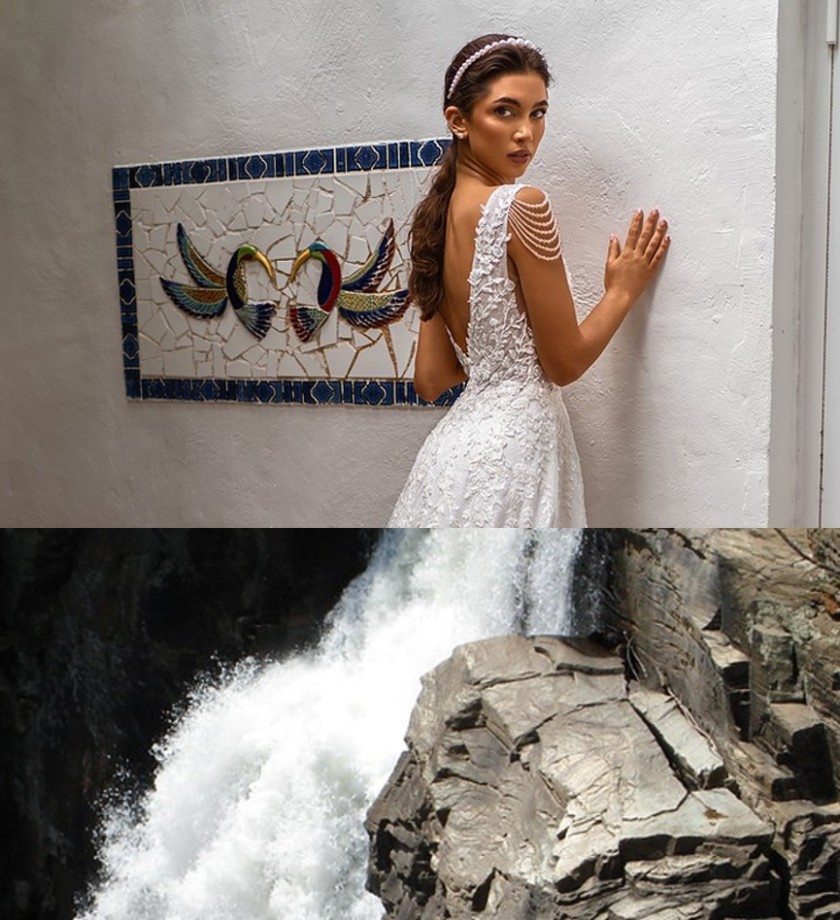
The combophoto assignment was kind of difficult for me because I am very anal about details, so I spent a long time searching the internet for pictures I could use that would line up well. For my initial idea, I wanted to involve birds in some way. I love bird wings because they’re beautiful, especially the underside where you can really notice how the bird’s feathers fan out. I wanted to combine a bird with flowers at first but that had its own set of deterrents. The first was that the flower images I could find had too many flowers in them. Because of this,  either the background of the image seemed too busy or the flower was too small for it to match up neatly with my selected bird images. Then I thought of combining the bird photo with fire or smoke to make a type of phoenix, but when searching for creative commons images, the majority of the ones involving fire were of forests being burned down (which looking back could have been really symbolic to combine an image of a bird with an image of its home being burned down, so as I write this I kind of regret not sticking with this idea). This resulted in too much smoke in the images so it was hard to see the actual fire, or similar to the flower issue, the background was too busy with all the trees and people that were trying to put out the flames. Moving on from the fire, my next idea was to use water, specifically a waterfall, and try to match it up with the tail feathers of a bird so that I could keep my favorite part (the underside of the wings) visible. Unfortunately, this idea didn’t work out because I couldn’t seem to find a bird that matched the color of the water well enough for it not to bother me.

Finally, I scrapped my bird idea and instead focused on the waterfall because it reminded me of the skirt of a wedding dress. After finding a waterfall with a cool water pattern I looked for dresses that closely matched the color and cropped the images together.  Despite the struggle I went through to get my final result, I’m happy with it because sketching odd dress designs was a staple activity of my childhood. I went through a long phase of thinking I would be a dress designer (this phase was initiated by watching Tinkerbell and seeing the fairy dresses made from leaves and flowers). I don’t think my final image conveys anything serious, rather it’s a homage to my childhood self and her generic yet enjoyable aspirations.

Candy Cane on the Seaside

I choose this photo because at first I was going to use a lighthouse to make a different combination but then when I searched up light houses I saw this one and thought the design was similar to a candy cane so I decided to take this route instead. Challenges that I faced when making this photo was trying to get them to line up and while it still looks a mess to me, this was the best I could do lol. Hopefully, my vision is still clear though. My final image convey’s a candy cane lighthouse because while lighthouse are rarely acknowledged, candy canes are know as a Christmas necessity so together they create the perfect balance of purpose in society.

Hasta La Vista Baby !

I have no idea how to express or say to this but let this particular image speak for itself

Reflection: honestly, I had no idea how this image was brought up. Originally, I was going to use a water bottle and convert into a spaceship, but while I was working on my Japanese 102 project, I noticed something about the plug next to me: the plug looked like a robotic face ! At that point I wanted to make a robot and I figured “why not make the robot muscular” and I wanted a nice background and this was the best bet. I wanted to add the cat bananas in the mix, so I made them the moon, which was pretty creative of me hahaha !

I don’t even know how to express this work piece. I was too scared to even publish because of how wild and out of the ordinary it can be portrayed. After looking at it, I had lots of fun creating it, and I know it going to grab a lot of people’s attention because of how bright and strange it may appear. I did struggle on getting to use the website, but after a few tinkering and maneuvering, I was able to make sense of it and create what I bestow upon you … Hasta La Vista Baby !

SKETCH 4: COMBOPHOTO

I didn’t think I had the creativity to do a project like this initially, so I called my mom for help. She wasn’t exactly sure either but she was drinking a cup of coffee and eating a cookie while taking to me, and she suggested I used those. So I thought it would be interesting if the cookie was under the coffee instead of a little saucer. I associate coffee with activity because of the caffeine, and this piece is in reference to how I encourage myself to work out and stay active before indulging in sweets. The biggest challenges I faced for creating the proper perspective and trying to sort out the right angles and spacing to make it look realistic.

Ship happens!

This post was related to photoshop and editing. I was looking at my bottle and spinning it around my table when I realized the shape and the body of the bottle looked somewhat similar to the lighthouse. The movement around the table was somewhat similar to a lighthouse where the light rotates 360 degrees to warn sailors. Therefore I decided to combine these two images. I was unable to edit the background out of the lighthouse. All in all I thought this was a fun assignment and I learnt to look at things with a different perspective and see how two different images or objects can actually come together as one.

Sketch 4: Combophoto

When the concept of combophoto was first introduced to me, I wanted to make an art piece that conveys a public interest. Then I remembered the article about the 1992 LA Rodney King Riots that I read the other day. The idea of using firearms in riots was extremely scary and nonsensical to me who came from South Korea, where personal possession of guns is banned. It was so terrible how such murder weapons were bound to be a means to an end for people: especially in the contemporary era, where it is believed that vote is the ultimate medium to make a voice. Today, I am not trying to make any judgments about the past incident in LA, neither about the police officers nor the rioters. What I am trying to say is that as much as I respect the culture and history of the US and the 2nd amendment I care about the people who have been wrongly sacrificed by gunshots. One definite thing is that guns are undoubtedly violent weapon that is capable of ending one’s life. From such a perspective, I suddenly felt the strong urge to tie the barrel so that it could not be shot. Hence, I combined a gun barrel with a tied rope. After doing so, the tied rope also seemed like the potential life of a shooter and victim. Also, I thought it could also resemble the social problem itself that we must untangle.

Credit

  • “pistol png PNG image with transparent background” from Luis Bell. Retrieved from “toppng
  • “Rope with tied knot on transparent background PNG” from Ra20Ga. Retrieved from “SimilarPNG

A Real—or not—Drawing

Given the unfavorable outcome of the assignment on which a controller resembled a head, I tried in this assignment to do a better job in combining photos, though apparently still not as favorable as I wanted it to be.

On one side, I chose a drawing back from high school in which a group of friends is hanging out somewhere in the desert, using the tree to cover them from the sun’s heat . On the other, I chose a photo of a lake just outside of the urban side of Riyadh. Combining them made sense to me since the lake added to the narrative of the drawing, in fact, it changed my own interpretation.

Quizzlers

The main challenges I faced were getting striking enough objects that I could make an interesting image out of, and lining it up in a way with the lighting where it looked realistic. I think my final image conveys a semi alternate reality where food and practicality are one, as the necessity for food is so universal that it creeps into everyday objects. This is a reality I would love to be in, as I am always hungry to eat whatever is in my field of vision. I chose these two objects because they were of a similar size, and shape, but unique enough that their breeding would be striking.

Yankee Hotel Cobtrot

Image Sources: https://www.flickr.com/photos/shutterrunner/32361652201/ https://pixahive.com/photo/a-corn-cob-2/

My collage depicts the Marina City Appartments, colloquially known as the Corn Cob Towers, in Chicago, Illinois. Playing on their nickname, I replaced the top half of the east tower with a corn cob. Coming into this sketch, I knew I wanted to work with urban features. My initial plan was to somehow fuse a cityscape with natural elements to create a neat dichotomy between dense urbanism and bucolic components. I experimented with skylines and other urban features I was familiar with in Chicago but could not develop a collage pairing that worked. Eventually, while browsing open-source images on google, I found a photo of the towers and it clicked right away.

Although my first attempt at incorporating the corn into an image of the buildings did not work, I quickly found two images that seemed to fit together like puzzle pieces. I am fortunate that someone decided to take a photo of a stock of corn from a downward peering-up angle and post it on the internet. It did not take long to crop it and seamlessly place it over a photo of the towers taken from a similar angle. I am proud of my name selection. Similar to a previous post, Paperback Rider, Yankee Hotel Cobtrot is a musical reference. It alludes to the Wilco album Yanke Hotel Foxtrot that depicts the same towers on its album cover. I replaced the syllable ‘Fox’ with ‘Cob’ in reference to, well, the corn cob.

Sketch 4: Combophoto

The Holy Broccoli

When first looking at the instructions for this week’s sketch, I immediately thought that I would like to use nature as the background and another object as part of nature. So my first idea was to use a broccoli and an image of mountains as the head of the broccoli. However, I found it weird to have the mountains as the head and felt that it couldn’t show the beauty of the mountains. So I decided to keep the broccoli but not the mountains. Then I remembered the scene in Shawshank where Andy makes Red find a tree. That tree felt like a holy tree that helped Red let go of himself, so I wanted to make a combo-photo of broccoli in a beautiful background and appear as a sacred tree. When finding a photo of a broccoli, it was hard to find one standing, looking normal and was clean. When editing the two images, it took some time for me to get used to the ‘cut out’ technology, but after getting used to it, I enjoyed making the two photos smooth into each other as if it was a single photo. The final image conveys that many things come from nature and that nature has the power even to make a single broccoli seem to be holy.

Image Credit

  • Broccoli: Uploaded by “Lux Obscura” found on Flickr
  • Nature: Uploaded by “Steven Penton” found on Flickr
css.php