
The Secret Language of Comics

Starry Night – A Triptych

Starry Night – A Triptych

Coming into this process, I had no idea what sort of triptych I wanted to produce. I think I initially felt limited by the three-square format, and my natural inclination was to craft some kind of joke with a gaffey punchline as seen in traditional Sunday Cartoons like Peanuts or Garfield. However, I eventually veered away from that idea after deciding I would enjoy the creation process a lot more if I pursued a topic I was interested in. I have been thinking about Vincent Van Gogh quite a bit lately. I believe there is something profound about the idea of a man who pursued what he found meaningful despite being overlooked by his peers. Van Gogh completely reframed his mindset. He refrained from concerning himself with his own material reality and began conferring with eternity: how his art will be remembered by those with whom he will never share a day.

My triptych portrays Van Gogh in his asylum room in Saint-Rémy-de-Provence, looking out the window at a starry night. Throughout the triptych, I try to establish that what we see and what Van Gogh sees are two completely different things. A one-eared Van Gogh looks into a starry night in the first slide. In the second slide, we see a close-up of his eye and the twinkling reflection of his vision. And finally, a complete starry night on the third slide. Captions at the bottom of each image inform the viewer throughout, both in French and English.
Sketch 5: Triptych

Yankee Hotel Cobtrot

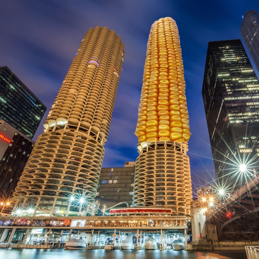
Image Sources: https://www.flickr.com/photos/shutterrunner/32361652201/ https://pixahive.com/photo/a-corn-cob-2/

My collage depicts the Marina City Appartments, colloquially known as the Corn Cob Towers, in Chicago, Illinois. Playing on their nickname, I replaced the top half of the east tower with a corn cob. Coming into this sketch, I knew I wanted to work with urban features. My initial plan was to somehow fuse a cityscape with natural elements to create a neat dichotomy between dense urbanism and bucolic components. I experimented with skylines and other urban features I was familiar with in Chicago but could not develop a collage pairing that worked. Eventually, while browsing open-source images on google, I found a photo of the towers and it clicked right away.

Although my first attempt at incorporating the corn into an image of the buildings did not work, I quickly found two images that seemed to fit together like puzzle pieces. I am fortunate that someone decided to take a photo of a stock of corn from a downward peering-up angle and post it on the internet. It did not take long to crop it and seamlessly place it over a photo of the towers taken from a similar angle. I am proud of my name selection. Similar to a previous post, Paperback Rider, Yankee Hotel Cobtrot is a musical reference. It alludes to the Wilco album Yanke Hotel Foxtrot that depicts the same towers on its album cover. I replaced the syllable ‘Fox’ with ‘Cob’ in reference to, well, the corn cob.

Sketch 4: Combophoto

Of Principalities

I had trouble with this assignment. In particular, I think I had trouble converting written ideas into drawn images. Perhaps I unknowingly chose a complex subject to capture visually. I selected my notes from my modern political thought course. The subject matter my notes address is Niccolò Machiavelli’s The Prince. The concepts Machiavelli discusses, which I consequently had to portray visually, are typically abstract and concern themselves with governance. I don’t know how to draw “governance,” though I tried to illustrate Machiavelli’s material points to his abstract rhetoric. For example, Machiavelli discusses Rome’s political structure throughout his chapter concerning mixed principalities. Accordingly, I drew a Roman pillar with an emperor-like figure flexing on top of it to represent the ideas Machiavelli discusses. Similarly, to represent Machiavelli’s conception of hereditary principalities, I drew a family tree in which progenitors die off, leaving only a single inheritor of power.

As well as illustrations of Machiavelli’s material references, I tried to incorporate details that encapsulated broader themes from my notes. For example, the crown resting on a prince’s head at the center of my drawing represents Machiavelli’s fixation on monarchical government. Similarly, I tried to depict Machiavelli’s conception of the principality, which is constantly watched over by its sovereign. I chose to do so by drawing a walled community and a pair of eyes fixated on it from atop a mountain. I also drew a bloodied dagger to represent Machiavelli’s more notable opinions regarding intrigue and the value of unconditional control in government. I do not think my drawings do justice to Machiavelli’s complex theories of government, though I don’t want to write off the practice of taking visual notes altogether. I think I might find them more effective if I took them while the professor lectured rather than while reflecting on my written notes. Perhaps I will try this for a different less conceptually abstract class.

Sketch 3: Visual Note Taking

On So.

“So.,” named for the first word of Seamus Heaney’s translation of Beowulf, is the abridged story of my odyssey as a reader and writer. It addresses seven key chapters over ten years and discusses maturation, uncertainty, and late-night clandestine reading operations. I revisited many of these chapters for the first time while writing So. Being able to consider them from a distance helped me summon a fresh perspective and craft a comprehensive narrative regarding my progression (and, perhaps regression) as a reader and a writer. I did not end up addressing many of the moments I thought I would though. For example, I ended up excluding the memory that I did my pre-writing about. Although it was rich with subtle details, it was not vested with the same meaning as many of the moments I wrote about were. Through writing So., I have forced myself to acknowledge that learning is not a linear process. Many of life’s most important lessons reveal themselves to you when you expect them the least. I have also learned that I should probably be reading more.

Read So.

Paperback Rider

I have been collecting and fiddling with playing cards for a few years, so naturally, I brought a deck to Idaho, where I am staying before the in-person semester begins. Before settling on using a playing card in my sketch, though, I fiddled with the idea of using a Banana to parody the famous The Velvet Underground & Nico album cover designed by Andy Warhol. However, I eventually decided that that idea was too derivative, and I would struggle to incorporate aspects of my own design.

My vision for the playing card was self-explanatory. Playing cards are meant to be held, so naturally, I drew a hand and placed the bicycle deck’s iconic Joker design appropriately according to the fingers’ grasp. I derived my hand from a handful of stock images, though I did not directly trace it. Frankly, to my own surprise, my hand turned out far better than I expected. I also wanted to incorporate an element of playfulness and dimension in my sketch so I included a rainbow bracelet naturally placed over the hand’s wrist. Initially, I wanted to use a gambling reference to name the sketch but could not settle on one that felt fitting or creative enough. I settled on a Beatle’s pun; Paperback Rider is a reference to the song Paperback Writer. I replaced the word writer with rider in reference to the joker’s iconic bicycle, and of course, the medium for my sketch was paper, thus paperback.

Avatar

Source: https://www.flickr.com/photos/mobili/33822454994/in/photolist-TwLVvL-8w2jnR-6wQHzV-2gbnxK5-eZ9yga-2zquiS-7wMXpy-58bMq-2g9XBnQ-2zm7fP-9rAetd-VnDscF-a37i54-a3a9rU-cmBvu3-a3a9pq-cmBsfb-fzuhas-PwAKpA-cmBtHu-65ePeA-2zqu2d-cmBwVQ-5Q28ZP-cmBAqS-566238-cmByDm-8BEc17-2zquPY-DCBtqy-2iL4TC2-6TUo2g-2krTTNu-2krXFJK-2krY87V-23MgDsP-bFVap6-2mN38Xf-2krY83M-2d9HudV-avSrfa-2krXFN7-2m9SkcH-2krTTH4-2krXFJ9-SBSiX-bPJgZx-2cY1Z9c-53Chru-EAjySK

I have lived in Chicago my entire life; the city was the backdrop to my upbringing. As a result, I fell in love with Chicago’s regal architecture from a young age. The building in my avatar is the Chicago Board of Trade building, my favorite example of art-deco architecture. I selected it to symbolize the influence Chicago has had on me. I think it captures the sense of unbridled energy that is endemic to downtown Chicago. I selected it because it represents everything that I love about Chicago.

I am not particularly fluent in technology. The most difficult part of the avatar creation process was navigating pixlr. The text function especially gave me trouble, as I felt overwhelmed by the sheer number of fonts that were available. Pixlr also froze up and crashed twice before I was able to successfully download my finished avatar.

css.php