The Secret Language of Comics

A Dress Fit for Silvermist
dress image and waterfall image

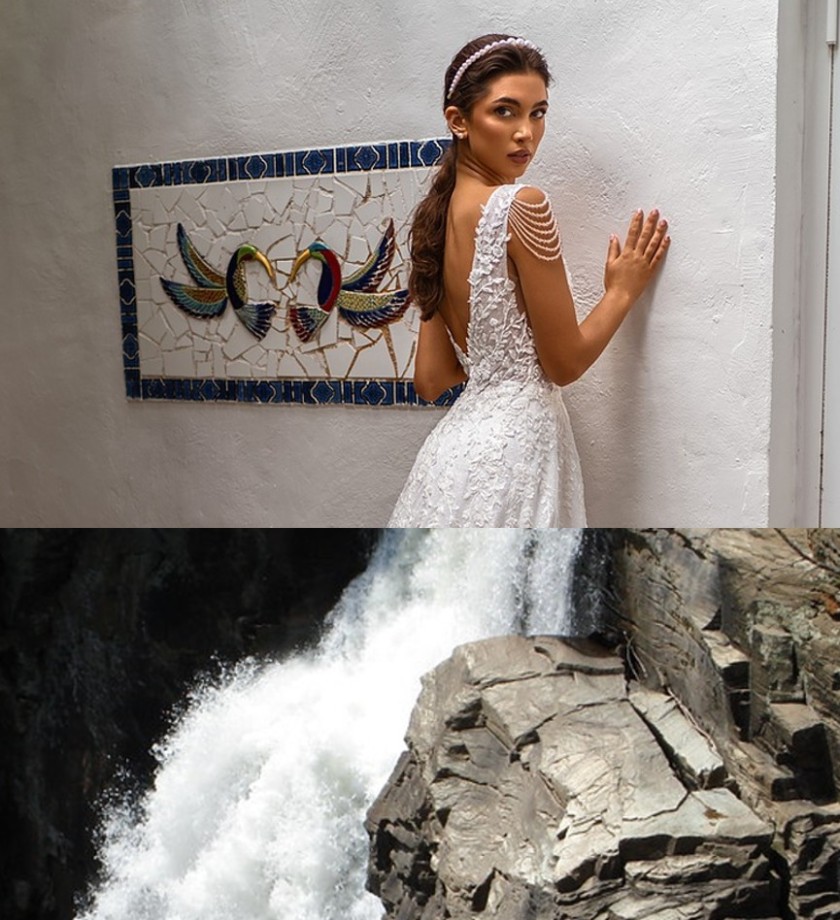
The combophoto assignment was kind of difficult for me because I am very anal about details, so I spent a long time searching the internet for pictures I could use that would line up well. For my initial idea, I wanted to involve birds in some way. I love bird wings because they’re beautiful, especially the underside where you can really notice how the bird’s feathers fan out. I wanted to combine a bird with flowers at first but that had its own set of deterrents. The first was that the flower images I could find had too many flowers in them. Because of this,  either the background of the image seemed too busy or the flower was too small for it to match up neatly with my selected bird images. Then I thought of combining the bird photo with fire or smoke to make a type of phoenix, but when searching for creative commons images, the majority of the ones involving fire were of forests being burned down (which looking back could have been really symbolic to combine an image of a bird with an image of its home being burned down, so as I write this I kind of regret not sticking with this idea). This resulted in too much smoke in the images so it was hard to see the actual fire, or similar to the flower issue, the background was too busy with all the trees and people that were trying to put out the flames. Moving on from the fire, my next idea was to use water, specifically a waterfall, and try to match it up with the tail feathers of a bird so that I could keep my favorite part (the underside of the wings) visible. Unfortunately, this idea didn’t work out because I couldn’t seem to find a bird that matched the color of the water well enough for it not to bother me.

Finally, I scrapped my bird idea and instead focused on the waterfall because it reminded me of the skirt of a wedding dress. After finding a waterfall with a cool water pattern I looked for dresses that closely matched the color and cropped the images together.  Despite the struggle I went through to get my final result, I’m happy with it because sketching odd dress designs was a staple activity of my childhood. I went through a long phase of thinking I would be a dress designer (this phase was initiated by watching Tinkerbell and seeing the fairy dresses made from leaves and flowers). I don’t think my final image conveys anything serious, rather it’s a homage to my childhood self and her generic yet enjoyable aspirations.

A Symbiotic Story

While creating my comic I struggled to come up with an idea at first. I’m a very wordy person and most of my stories tend to run long, so writing a short one with only three panels was really difficult for me. I ended up creating a comic about a clownfish trying to escape a shark by hiding in the tentacles of a sea anemone, thus beginning a symbiotic relationship with the creature. With the idea for the story in mind, the composition wasn’t very hard to figure out. Because I only had three panels to tell the story, the composition had to be very straightforward in order to fit all the important details. The first panel introduces the conflict of the story: a clownfish is being hunted by a shark. The second panel shows the middle: the clownfish finds a solution to his problem and asks the sea anemone for help. Then finally the third panel is the conclusion: The shark lost the clownfish and the clownfish and sea anemone become partners.

This assignment was different than most writing I do because I had to incorporate pictures in my storytelling in a way I normally don’t. Especially because we had so few panels, the images had to be the primary storytelling elements. This, unlike most writing assignments, forced me to extremely minimize my word usage. I tend to write long, detailed stories and for this assignment, I had to pick and choose which details to include in order to efficiently use the space while still getting the same impact. Overall I found the triptych comic challenging, but enjoyable.

Genetics: A Cat Love Story

Sunday Sketch 3

Sketching my notes helped me to understand the content much better because I had to think about the topic in a different way in order to draw it. I was forced to simplify the topic more because I am only able to draw simple images, and this helped me especially when trying to verbally explain genetics. I also like how through sketching my notes I now associate key terms with images allowing me to memorize vocab much easier. My learning style is the cross between a visual learner and someone who learns best through reading and writing, so drawing my notes out helps to a certain extent. I think it would help me better to take written notes and include diagrams and images along the way, or maybe make a small sketch of my notes at the end of each section to act as a recap.

Reflection – “The Game”

There are many experiences that shaped me as both a consumer and producer of stories, but the earliest and most fundamental for me was the creation of what my siblings and I creatively called “The Game.” In my Literacy Narrative (“The Game”), I explain this long-lasting game of pretend and how it brought storytelling into my life. 

Through this assignment, I’ve learned that one of my greatest weaknesses when it comes to writing is getting started. I get too focused on what the end result will be rather than focusing on telling the story. The pre-writing really helped me combat this issue because it forced me to free-write within a time limit. This ensured that I didn’t have enough time to second guess or edit what I was saying until my time was up. The prewriting also helped me realize exactly how much I grew up writing, reading, and storytelling and although I didn’t use the exact story from my original prewriting exercise, I did write about the same topic.

It’s hard to view my writing through the eyes of others simply because of how many times I’ve reread it, but I think the following sentence would be viewed as most interesting due to its relatability. “Instead of games of pretend, my portals became sheets of college-ruled notebook paper and a 24 pack of mechanical pencils.” Everyone who writes (or partakes in any artistic hobby) probably remembers when they made the switch from simply benign someone with an imaginative mind to being someone who makes something with that creativity.

Three’s a crowd

Single-hole punchers have always looked like some type of animal to me. The side responsible for punching the holes makes a perfect mouth and the little screw where the 2 sides connect makes a great eye. Coming up with an idea for this assignment wasn’t difficult because I simply had to decide which animal a hole punch reminds me of most, and today, that animal was a snake. More specifically, I was imagining a snake with one head and two tails. Snakes like this don’t actually exist in nature so I decided to instead draw a two-headed snake interacting with the silver imposter.

At first, I wasn’t going to add color to this sketch because I wanted the snake drawings to be more similar to the hole punch, so simply using a pencil would help me achieve this, but after adding the details I had the idea to put the entire drawing under green light so that the silver hole punch could reflect the color. After I took my picture, I added a tongue and more green coloring to the hole punch via basic iPhone photo editing.

My Avatar

Have you ever seen a transformation between a human to a wolf in a werewolf movie where during the transformation the character kind of just flips back and forth really quickly between each skin? A less violent version of that concept is what I was going for when making my design. I have different faces for different situations and environments, and I live my life constantly switching between them. My brain works similarly, always bouncing back and forth between ideas and concepts. My thoughts are never really still so I wanted to create an image that also showcased movement of some kind. To achieve this, I layered three images of myself to represent both how it feels inside my head and how I am constantly changing. I also tried to incorporate a lot of colors because I’m a very colorful person and I enjoy bright, happy things.

This assignment was challenging for me because my initial plans started in a completely different direction than my end result (which is very similar to how I visualize my brain working). Originally, I intended to draw my icon, but I’m not very artistically talented when it comes to getting what is in my brain onto paper. I started out by brainstorming all the things I enjoy doing and then sketching those things in a fun arrangement. I ended up hating this first sketch for 2 main reasons: 1) My interests are constantly changing and therefore very random. I go through very short phases of being obsessed with something for a couple of weeks before moving on to another interest, so I have a lot of very small interests, but none of them really seem significant to my life nor do they seem to accurately represent who I am as a person. 2) Because of the randomness of my interests, the drawing seemed to lack connection or flow, but instead looked like a bunch of random images that were simply thrown together on the page. I didn’t like this because I like organization and my sketch was the opposite of that. So, in my final icon, instead of including literal symbols of my hobbies, I decided to represent them by including boxes of divided color to demonstrate how my hobbies are random, yet still somewhat overlap between different categories. Next, I attempted to draw myself, but this went even worse than the first sketch (who knew trying to recreate a picture of yourself could be such a toxic activity), so I decided to edit an image of myself using pixlr which brought along a new batch of difficulties due to my inexperience with editing. Besides the technological difficulties, I’m excessively anal about unimportant details, and therefore having too many choices really distracts and stresses me out, so as minor as it seems, figuring out the correct font and color for my name was very difficult for me and I probably spent an excessive amount of time on that one detail. Despite these challenges, I am very happy with the end result.

css.php