The Secret Language of Comics

Sunset or Sunrise

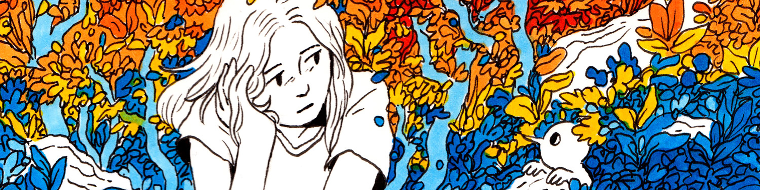
When looking at the instructions of this week’s sketch, I immediately thought of the picture that I took back when I was in high school. My high school was located on Jeju, an island at the south end of South Korea with beautiful skies. I wanted to talk about the beautiful sunset view, which usually means that the day is ending, but I chose to question people if they think it’s a sunset or sunrise. The message that I wanted to send throughout this triptych was that whether the picture is a sunrise or sunset is not what is essential, it is about what people think of it. If some consider it as a sunset, it would mean that they are willing to take a break, while a sunrise would mean that they’re ready to start an afresh journey and step up.

Crafting this sort of comix strip was different from other writings I’ve done this semester in using images (or drawings) when delivering the message I want. Also, I needed to make the text short and precise because there wasn’t as much space for me to write down further explanations about what I intended to say, as I was used to doing for the writings I’ve done this semester. However, this activity had similarities with my previous works in trying to deliver the message that I wanted to say clearly. Overall, I enjoyed this activity and am looking forward to taking such an experiment when creating my comic. 

Sketch 5: Triptych

I found this assignment to be very fun and enjoyable. I liked having the freedom to express myself playfully through the form of the triptych. One thing I found to be very difficult was the process of actually picking an idea and sticking to it. I am not the best artist so I found myself eliminating ideas that I didn’t think I would be able to draw. Although I am not sure I was able to have a witty or overly creative idea, I think that my triptych was a fun way to incorporate animals and people together as well as including dialogue. Also, I was conflicted on whether to use colored pencils or regular pencils and I think that I like the pencil with this. Since the triptychs have so little writing and still have to fit a lot into the panels, I think that the pencil made it less busy and easier to process. This assignment was very different from what we have done previously this semester because we had to craft more of a narrative in our comics but in a small amount of space. Overall, I enjoyed this assignment and I found it to be a great way to express a more creative side of myself.

Venus Fly Trap

Creating a triptych seemed like an easy assignment at first. However, coming up with a storyline was a lot more difficult to complete. I had no idea what my storyline should be about. Then I started to think about sloths, but I did not know what I wanted my story to go. Then, I thought about how weird Venus fly traps are. So, I decided to do a triptych about the peculiar nature of how they need more than the nutrients in the soil to satisfy their needs. Making this comic is similar to other writings I have done previously because I had to make sure that it had a beginning, middle, and end.

Starry Night – A Triptych

Starry Night – A Triptych

Coming into this process, I had no idea what sort of triptych I wanted to produce. I think I initially felt limited by the three-square format, and my natural inclination was to craft some kind of joke with a gaffey punchline as seen in traditional Sunday Cartoons like Peanuts or Garfield. However, I eventually veered away from that idea after deciding I would enjoy the creation process a lot more if I pursued a topic I was interested in. I have been thinking about Vincent Van Gogh quite a bit lately. I believe there is something profound about the idea of a man who pursued what he found meaningful despite being overlooked by his peers. Van Gogh completely reframed his mindset. He refrained from concerning himself with his own material reality and began conferring with eternity: how his art will be remembered by those with whom he will never share a day.

My triptych portrays Van Gogh in his asylum room in Saint-Rémy-de-Provence, looking out the window at a starry night. Throughout the triptych, I try to establish that what we see and what Van Gogh sees are two completely different things. A one-eared Van Gogh looks into a starry night in the first slide. In the second slide, we see a close-up of his eye and the twinkling reflection of his vision. And finally, a complete starry night on the third slide. Captions at the bottom of each image inform the viewer throughout, both in French and English.

Sketch 5: Triptych

“Don’t worry, be happy” – Anirudh Seshadri

The triptych above is a simple sequence of events. A man is sad, someone lifts up the ends of his mouth into a smile, and he stays there smiling.

When thinking of ideas, I thought about my week and how draining it was. Naturally, I thought that this was what the rest of my semester would look like, and because of this, on a Friday night, I was feeling sad with a bleak outlook on the next few months.

The next morning, I decided to just not be sad. I smiled in the mirror for ten seconds and went about my Saturday morning. Making that small decision to just begin smiling made my day so much better and was the inspiration for the triptych.

I think the minimalist style conveys a strong message to the reader. There aren’t any hidden clues or flamboyant imagery that symbolize something, it’s just telling you “Don’t worry, be happy.”

Hasta La Vista Baby !

I have no idea how to express or say to this but let this particular image speak for itself

Reflection: honestly, I had no idea how this image was brought up. Originally, I was going to use a water bottle and convert into a spaceship, but while I was working on my Japanese 102 project, I noticed something about the plug next to me: the plug looked like a robotic face ! At that point I wanted to make a robot and I figured “why not make the robot muscular” and I wanted a nice background and this was the best bet. I wanted to add the cat bananas in the mix, so I made them the moon, which was pretty creative of me hahaha !

I don’t even know how to express this work piece. I was too scared to even publish because of how wild and out of the ordinary it can be portrayed. After looking at it, I had lots of fun creating it, and I know it going to grab a lot of people’s attention because of how bright and strange it may appear. I did struggle on getting to use the website, but after a few tinkering and maneuvering, I was able to make sense of it and create what I bestow upon you … Hasta La Vista Baby !

SKETCH 4: COMBOPHOTO

I didn’t think I had the creativity to do a project like this initially, so I called my mom for help. She wasn’t exactly sure either but she was drinking a cup of coffee and eating a cookie while taking to me, and she suggested I used those. So I thought it would be interesting if the cookie was under the coffee instead of a little saucer. I associate coffee with activity because of the caffeine, and this piece is in reference to how I encourage myself to work out and stay active before indulging in sweets. The biggest challenges I faced for creating the proper perspective and trying to sort out the right angles and spacing to make it look realistic.

Ship happens!

This post was related to photoshop and editing. I was looking at my bottle and spinning it around my table when I realized the shape and the body of the bottle looked somewhat similar to the lighthouse. The movement around the table was somewhat similar to a lighthouse where the light rotates 360 degrees to warn sailors. Therefore I decided to combine these two images. I was unable to edit the background out of the lighthouse. All in all I thought this was a fun assignment and I learnt to look at things with a different perspective and see how two different images or objects can actually come together as one.

A Real—or not—Drawing

Given the unfavorable outcome of the assignment on which a controller resembled a head, I tried in this assignment to do a better job in combining photos, though apparently still not as favorable as I wanted it to be.

On one side, I chose a drawing back from high school in which a group of friends is hanging out somewhere in the desert, using the tree to cover them from the sun’s heat . On the other, I chose a photo of a lake just outside of the urban side of Riyadh. Combining them made sense to me since the lake added to the narrative of the drawing, in fact, it changed my own interpretation.

Yankee Hotel Cobtrot

Image Sources: https://www.flickr.com/photos/shutterrunner/32361652201/ https://pixahive.com/photo/a-corn-cob-2/

My collage depicts the Marina City Appartments, colloquially known as the Corn Cob Towers, in Chicago, Illinois. Playing on their nickname, I replaced the top half of the east tower with a corn cob. Coming into this sketch, I knew I wanted to work with urban features. My initial plan was to somehow fuse a cityscape with natural elements to create a neat dichotomy between dense urbanism and bucolic components. I experimented with skylines and other urban features I was familiar with in Chicago but could not develop a collage pairing that worked. Eventually, while browsing open-source images on google, I found a photo of the towers and it clicked right away.

Although my first attempt at incorporating the corn into an image of the buildings did not work, I quickly found two images that seemed to fit together like puzzle pieces. I am fortunate that someone decided to take a photo of a stock of corn from a downward peering-up angle and post it on the internet. It did not take long to crop it and seamlessly place it over a photo of the towers taken from a similar angle. I am proud of my name selection. Similar to a previous post, Paperback Rider, Yankee Hotel Cobtrot is a musical reference. It alludes to the Wilco album Yanke Hotel Foxtrot that depicts the same towers on its album cover. I replaced the syllable ‘Fox’ with ‘Cob’ in reference to, well, the corn cob.

Sketch 4: Combophoto

css.php